NEW YORK FASHION WEEK FW11
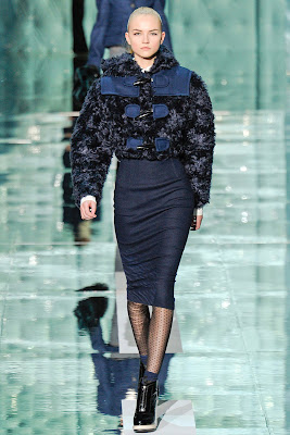
The show started on time and with Marilyn Manson blaring. A quilted cylinder and glass floored runway was the scene for the Fall Winter 2011 show. 40's silhouettes and polka-dot hosiery. Small side hats throughout the looks mostly matching the top, bottom, or entire look all together. (A Marc trademark now known to the fashion world,...incorporating hats with looks) Very bold and minimalistic in color, and every piece has a very structured look. Long skirts and high neck lines. The ruffling around the neck gave a lot of the looks a modern Victorian feel if that's even possible. Shoes- the boot-wedge combo is an interesting off set to the very structured patterns and soft fabrics. Marc is always changing and everyone is always watching to see what he does next...and sending out 63 perfectly tailored looks that all have a theme throughout is why Marc Jacobs will continue to stay a front runner in this business.
RODARTE.
With The Wizard of Oz's Wicked Witch of the West, 'Garland's Ruby Slippers' alongside twisters and wheat fields on their FW mood board...(which I got a glance of on Tumblr before the show yesterday) I really did not know what to expect. A full look in ruby and a flowing wheat field print on the bottom hem of the skirt is not what I expected, but I have to say it was a refreshing collection all together. If someone wanted to look sexy on the country side and still stay in theme then this collection would be perfect. The Mulleavy sisters have a way with knits and colors...the sweaters in the collection have a block of color all adding a side to shape a square. The natural waist accent is present in most of the more structured looks giving a flattering shape to the pieces. The colors are very calming and neutral, but also very eye-catching with a popping/bright primary red and lilac. Personally, the most intriguing concept of this collection is how the shape of the square is used to frame the figure and complete the pattern of some entire looks.
ALEXANDER WANG.
Fur rimmed sunglasses and quilted cape coats. Alexander Wang is one of those designers who highlights soft and hard materials in his looks. There is an attitude in his work that so interesting...it has to be based on the shape and material because the entire collection consists of mostly black, nude, and gray. Pops of metallics in the shoes and accessories give a playfulness to the all neutral look. My favorite pieces are the glitter-ized pants paired with a fur lined collared jacket and shrunken sweater underneath.-Also, a sleeveless tuxedo-style shirt-with bib under the sheer paired with leather patched black pants with zipper pockets from waist to knee. The accent of the Alexander Wang girl who has sex appeal and also a somewhat boyish taste in style is definitely praised in this collection with sex appeal and practicality all in one. Oh, and did I mention the furry pumps? Enough said. Genius.
Photo credit to : STYLE.com & ELLE.com


No comments:
Post a Comment